Education | B2B Web App
The Stillpoint Experience
The StillPoint Experience is a leadership skills program designed to help leaders and teams improve problem-solving, decision-making, and sustainable performance.
The Results: a 24% increase in dashboard usage and on-time completion of user learning sprints.
Timeline: 2 months
Role: UX Research + UI Design
Team: Program CEO, 2 Developers

Project Overview
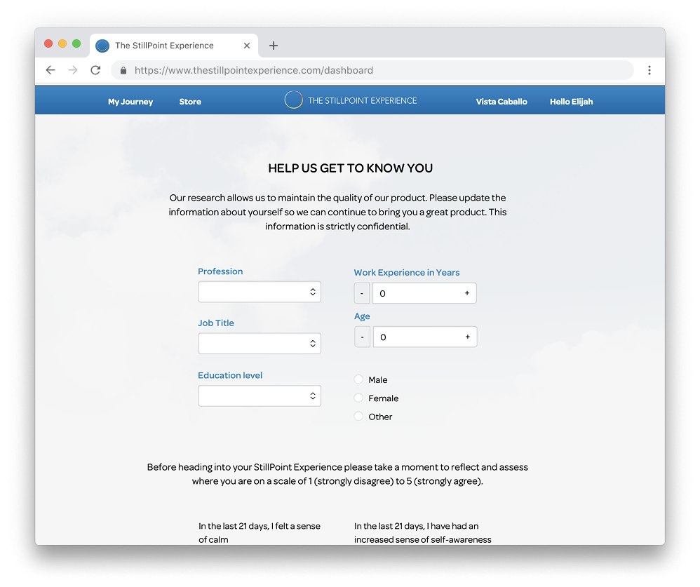
The StillPoint Experience is a self-guided tool to help business leaders develop innovative thinking as a skill. They would do this by learning to balance a different style of thinking with each challenge they chose to solve. Users would then log in to their dashboards daily to work toward solving that challenge by using a strategy geared toward a specific thinking style.
The Challenge: Users didn’t fully understand how to use the platform. They reported feeling overwhelmed after completing onboarding and weren’t sure what to do once they reached the main dashboard.
The Solution: A reorganized user flow that aligned the business’s unique teaching methods with standard learning expectations for users who joined the program. The redesigned dashboard for increased navigational hierarchy prioritized areas of focus when users returned to the platform.

User Empathy: Identifying Common User Pain Points
User Feedback
Platform users stated that onboarding was easy to complete. Interviews with users convered that they didn’t fully understand what they were doing during onboarding.
Onboarding Pain Points:
Challenge Setup: Uncertainty about the type of challenge to focus on
Users didn’t know where to find their Balance Point assessment test results.
Overwhelm related to the downloadable learning modules they were intended to read before reaching their dashboards.
Confused about where to navigate first upon reaching the main dashboard.
Due to daily time constraints, most learners would stop reading and go directly to the main dashboard, expecting a streamlined experience to get started, but were still unsure of what they were supposed to do when they reached it.
Dashboard Data
After logging into the main dashboard, users would frequently revisit the Learning Modules they skipped during onboarding.
The dashboard was cluttered and overwhelmed users as they tried to determine where to start. The top-clicked areas of the Dashboard were the “Choose a Strategy” dropdown, “Start Timer” button, and Learning Modules.
Many users would start the timer and complete the strategies, as recommended, on paper instead of on the platform.
Users Felt
Unsure of how their strategies related to solving their challenges.
The balance point assessment they took while onboarding was easy to complete.
Unsure of what type of challenge would be ideal to solve in a sprint.
*Users wanted clarity on the purpose of the challenge and felt unclear on how to set themselves up for success.
Users Thought
Strategies to solve their challenge could be done offline and added online later.
*Users weren’t tracking their true progress on the dashboard.
Their thinking style was unrelated to the strategies assigned based on the balance point assessment.
The dashboard would be intuitive enough to use without additional information.
Users Said
Ask questions to better understand “what their balance point was”
Want time specific reminders to complete their daily strategies
“Depending on the strategy I choose, I’ll sometimes complete the it on paper.”
*Users would drop off from the platform while completing a strategy and forget to log the work they did on their dashboard.
“I’m not sure where to start on my dashboard when I log in”
*The dashboard’s content was cluttered, making navigational hierarchy unclear to new and returning users.
“I planned to read the rest of my assessment results, but it’s a lot. I haven’t had time to finish.”
Users Did
Read the Learning Modules they skipped during onboarding after being told what they would learn from by reading the modules.
User Journey Mapping: Reviewing the Originally Designed User Flow
The original user flow focused on having the user:
Onboard and set up notification reminders
Define and save a learning sprint challenge,
Complete an assessment,
Choose an “aspect” of focus for their learning sprint,
Download and read their test results, which were only accessible by downloading their program’s Learning Modules.
After completing the first 4 onboarding steps, users felt ready to begin working on their dashboard.

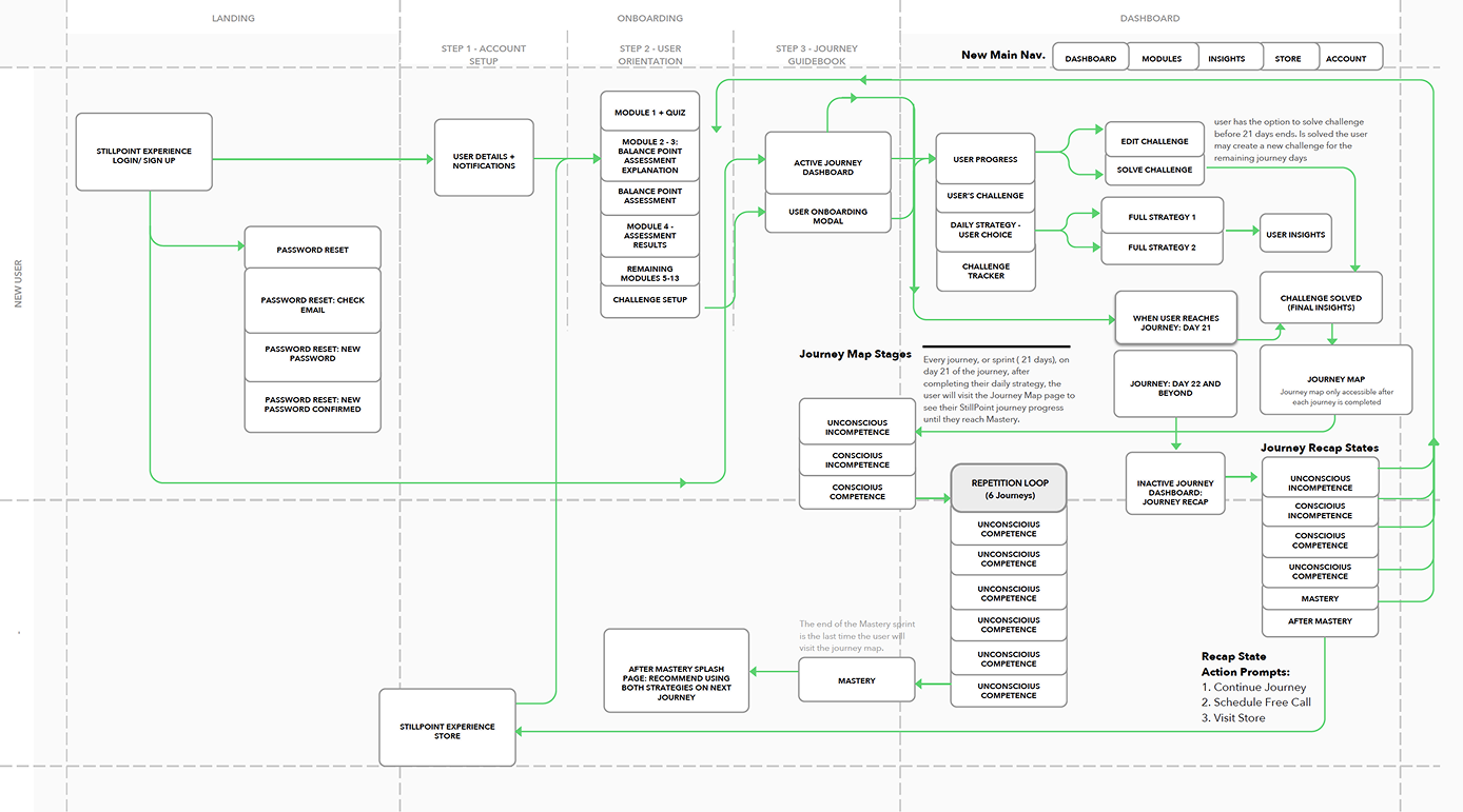
Design: Selected New Features
Breadcrumbed Onboarding: Breadcrumb links were added to the onboarding flow to show user progress toward the activity dashboard.
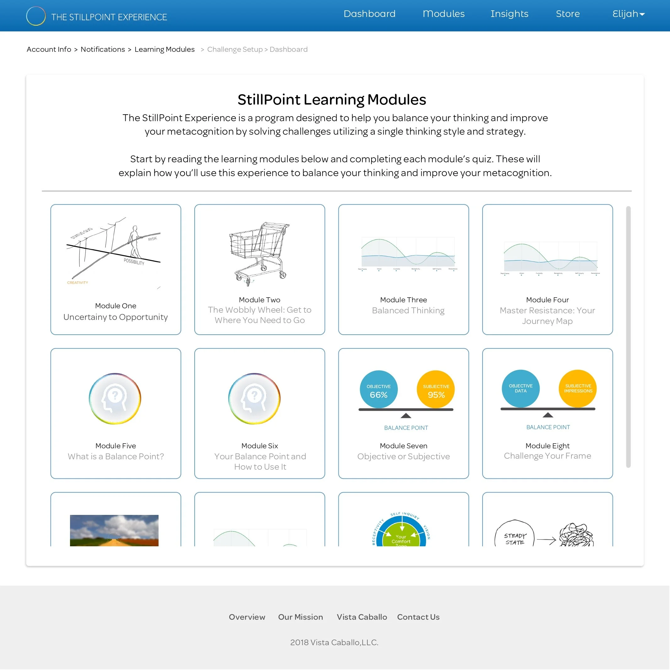
Integrated Learning Modules: Learning Modules and the Balance Point assessment introduce key concepts early on, and brief quizzes were added to ensure comprehension before advancing.
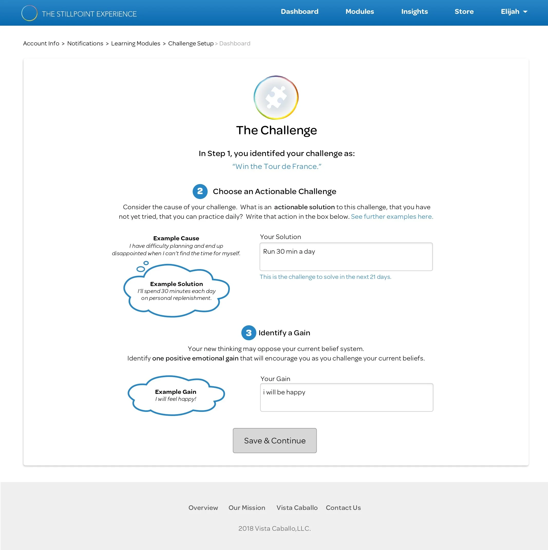
Challenge Setup Cues: Examples and refined microcopy (not shown) clarified how to select challenges, their purpose, and duration to help users choose goals that aligned with their assessed thinking style.
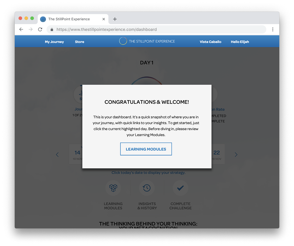
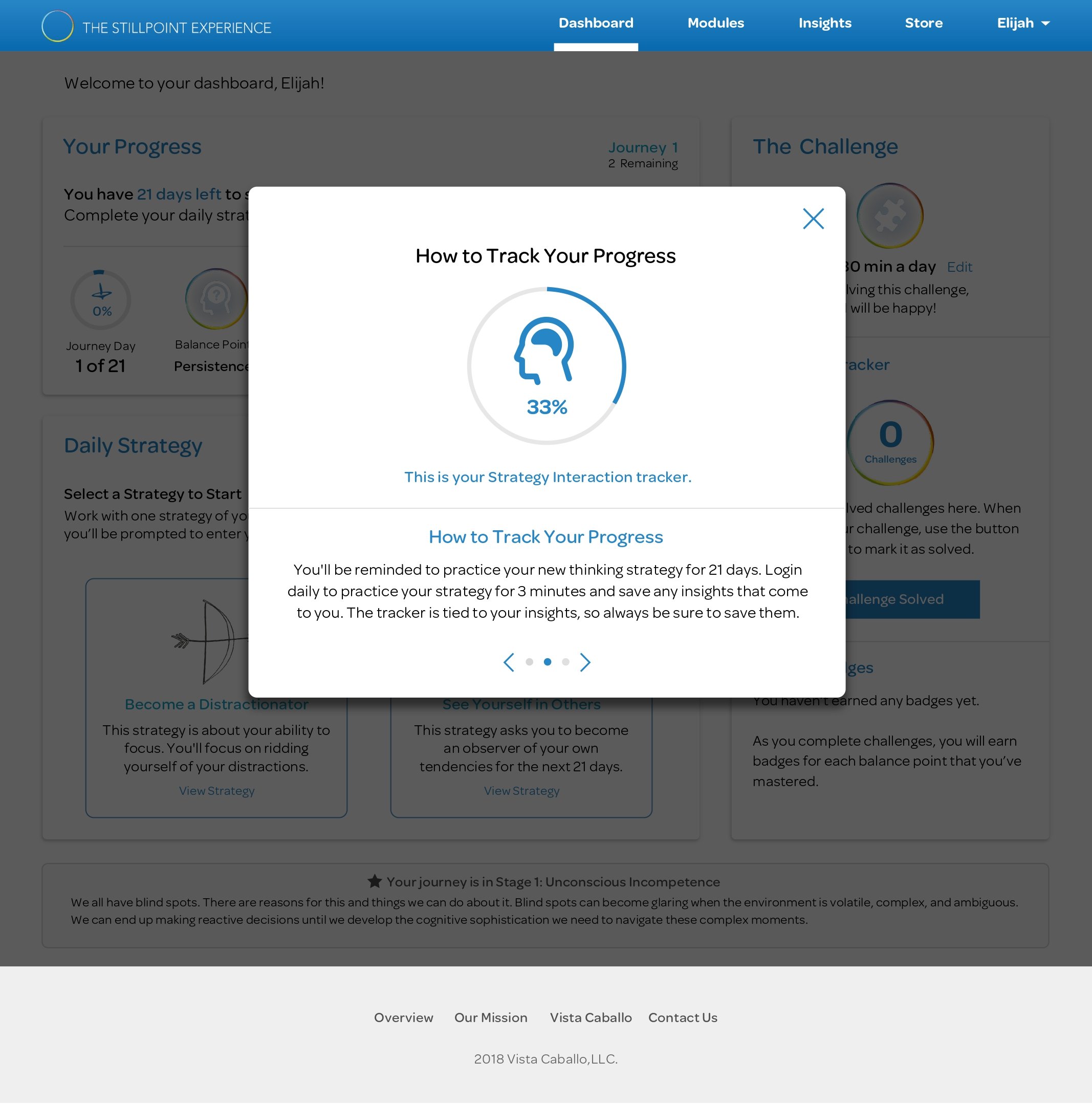
Dashboard Redesign: The dashboard was fully redesigned for clearer navigation and visual hierarchy. New features like challenge history, insight libraries, progress trackers, and badges were added to help users visualize their growth.
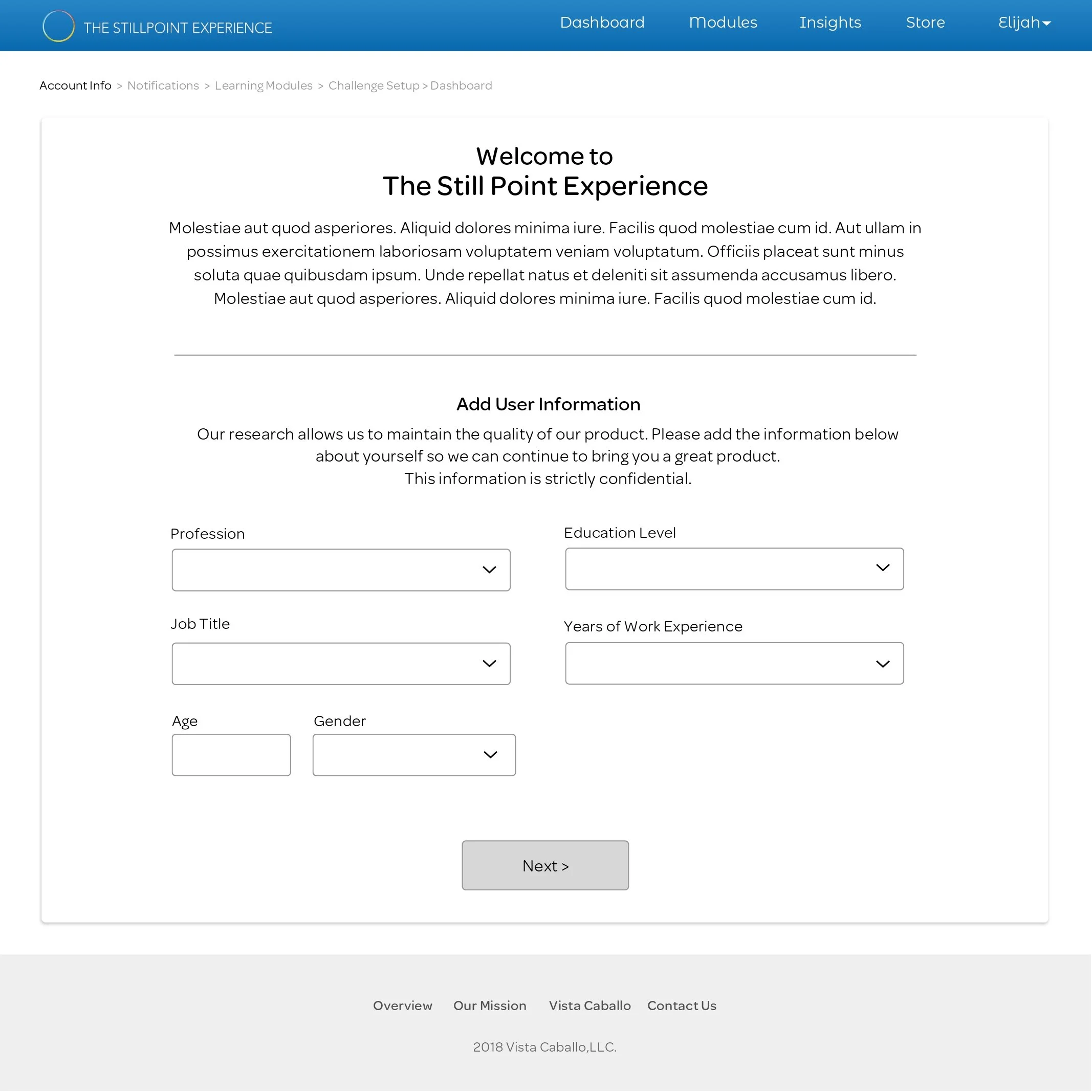
Onboarding: Account & Notification Setup
Built-in Learning Modules & User Assessment


Challenge Setup Cues
Dashboard Redesign


Design Iterations & Launch Results
Streamlining the Mobile Interface:
To complement the desktop dashboard redesign, a mobile-first experience was introduced to improve accessibility and engagement on smaller screens. The update prioritized quick visibility of key information—enabling users to take meaningful action faster and boosting daily activity rates.
Features Included:
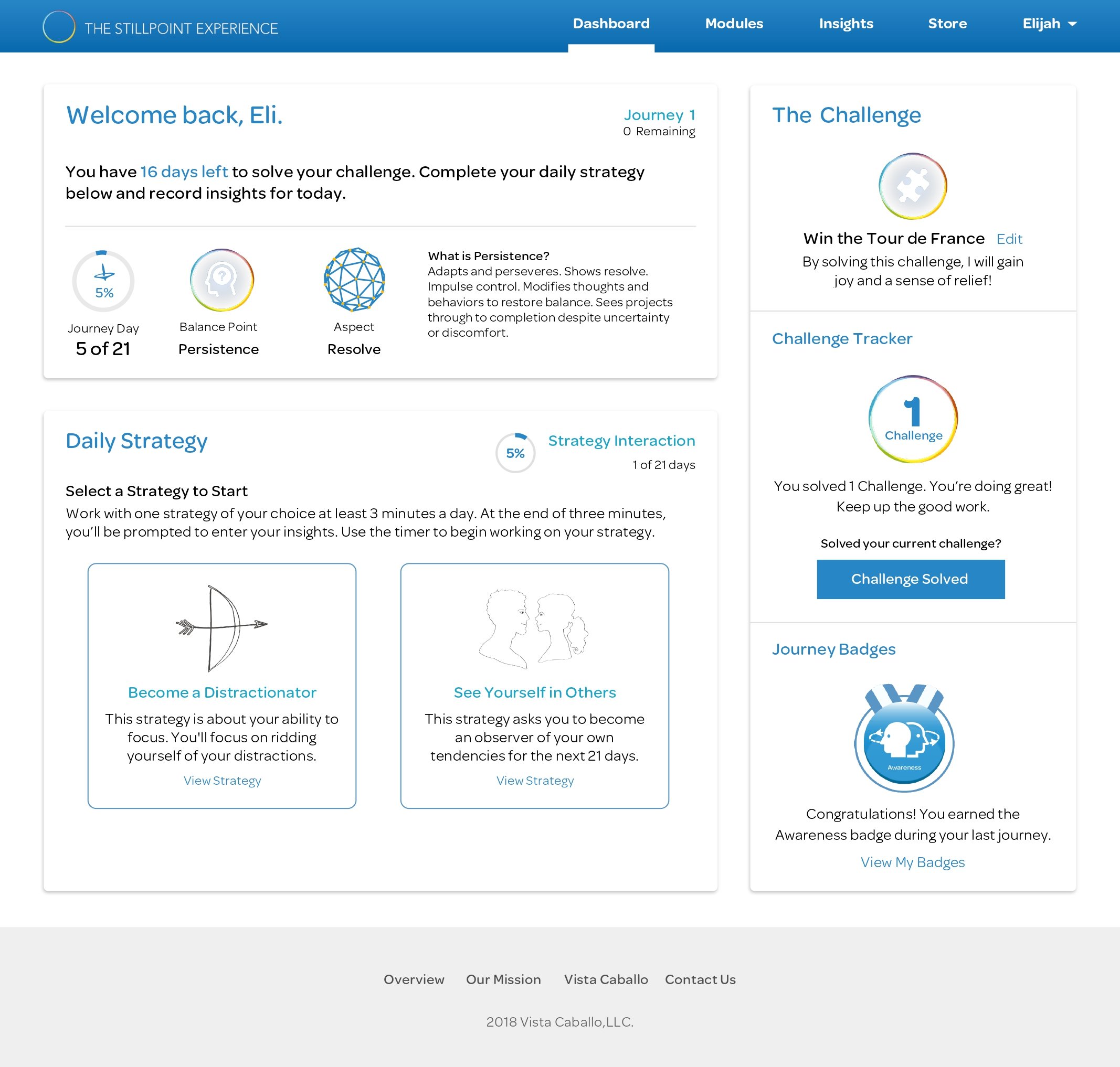
Easy Reference Widgets: Dashboard content was restructured into three focused widgets — Journey Tracker, Daily Strategy, and Challenge Tracker — providing a clear, goal-oriented framework.
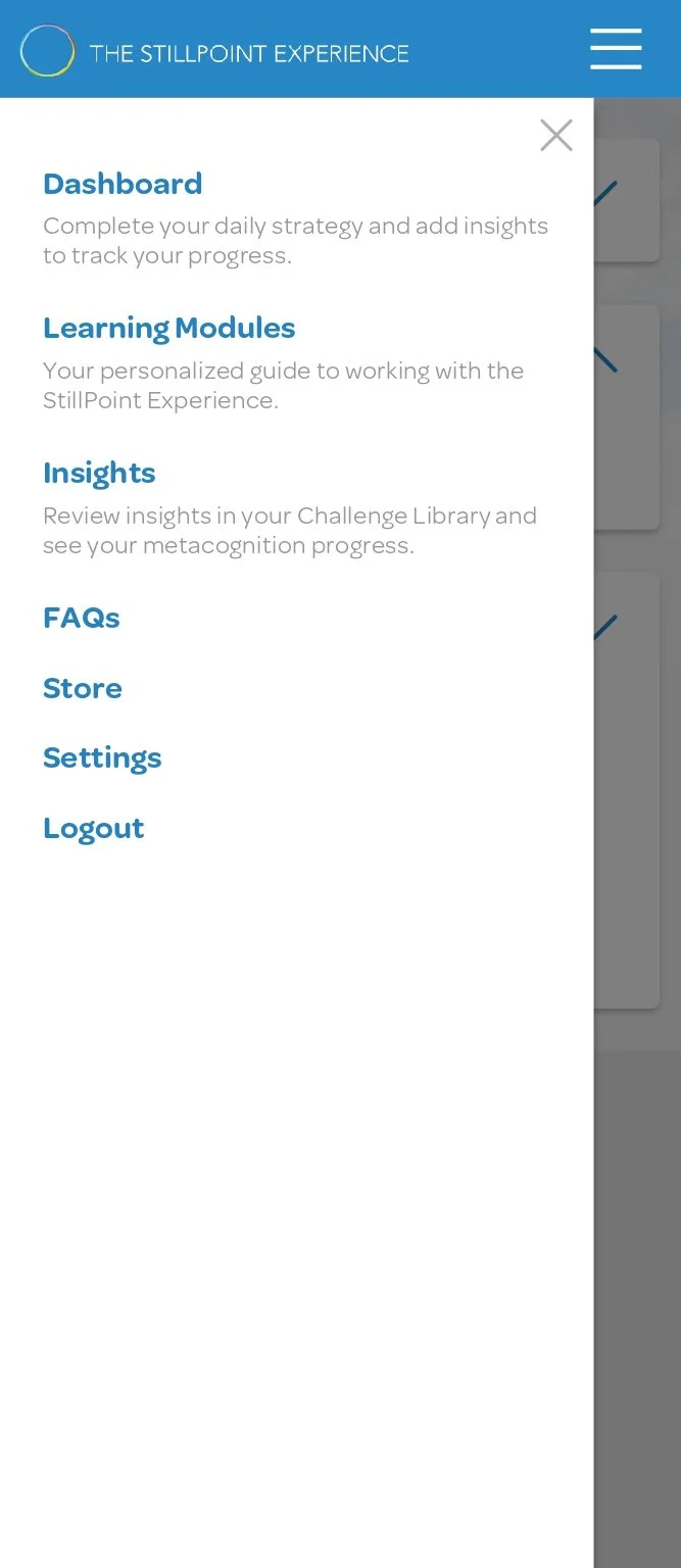
Updated Navigation: Simplified navigation with quick links to high-value content improved task flow and reduced friction.
Journey Tracker: Displays remaining time to complete a task and reinforces each user’s balance point for better self-management.
Daily Strategy: Guides users through daily focus exercises with integrated timers and insight capture.
Challenge Tracker: Highlights current challenges, progress, and earned badges to sustain motivation and momentum.
Following implementation, users described the experience as clearer, faster, and more intuitive, noting it was easier to complete and save insights from daily exercises.
Launch Results:
Within three weeks of launching the redesigned learning dashboard, user activity increased by 24%.

Learnings:
The CEO stated these changes were exactly what the platform needed to ensure that users understood the platform before beginning their learning journey. Integrating different chapters of the guidebook into the user’s onboarding process and adding interactive quizzes ensured that each user learned how to use the dashboard before reaching it.
User pain points in platform usage were the symptoms of underlying issues in the platform’s original user flow: Before changing the user flow, there had been a focus on applying changes to task-specific dashboard features based on general feature requests.
Considerations for Future Iterations:
Determine how we might provide challenge suggestions that users can start with before choosing their own.
Explore introducing in-dashboard strategies that would allow users to interact with the platform while working through each strategy.
Consider whether an app-based interactive learning experience would allow users to work through strategies more efficiently.
