Wells Fargo Go-Far Travel Rewards
Role: Lead designer (Wireframes, UI, final handoff)
Team: 1 designer, 1 business analyst, 2 developers
Wells Fargo engaged CTM to improve the user experience of their Go-Far Travel Rewards platform, which managed hotels, flights, rental cars, and travel experiences for cardholders. Based on internal user feedback and competitive analysis (Expedia, Priceline, Chase Rewards), I was tasked with redesigning the homepage to make trip planning faster and more intuitive.
The Results: Redesigning Wells Fargo’s Go-Far Travel Rewards homepage made it faster and easier for cardholders to search and book trips. Homepage searches increased by about 18%, while cruise and hotel bookings rose by roughly 10%, and engagement with the new Featured Offers cards launched with 25% engagement, a 4× improvement over the old interactive map. These improvements translated into tens of millions of dollars in additional travel redemptions across Wells Fargo’s rewards program.

Homepage Usability Enhancement
Enhancing the Travel Rewards Browsing Experience

Project Overview:
Redesigning the Travel Rewards Homepage
Wells Fargo wanted to modernize its Go-Far Travel Rewards experience, giving cardholders a faster and more intuitive way to search and book travel products, including hotels, flights, cars, and cruises.
The Challenge:
Users struggled to quickly find and book travel due to a cluttered homepage, confusing navigation, and hidden offers.
The Solution:
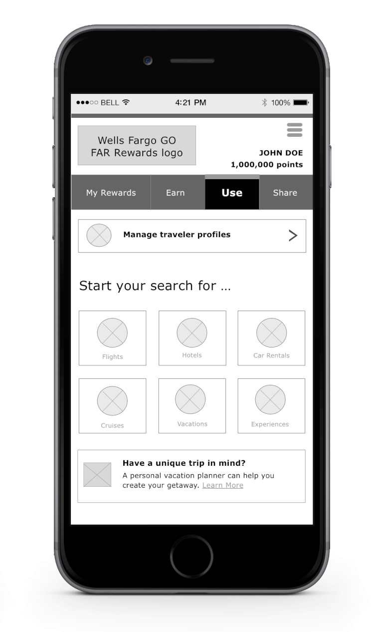
Redesigned the homepage with a streamlined search widget, simplified navigation, and new features like traveler profiles and featured offers to make booking faster and more intuitive.
User Empathy: Review of User Feedback and ADA-compliance
Interviews conducted with travel rewards members revealed that features that were intended to ease the browsing experience and inspire trip planning had become friction points:
Redundancy in navigation: The page repeated primary travel product links in multiple places as part of the primary subnavigation, within hero content, and in the page footer, cluttering the experience
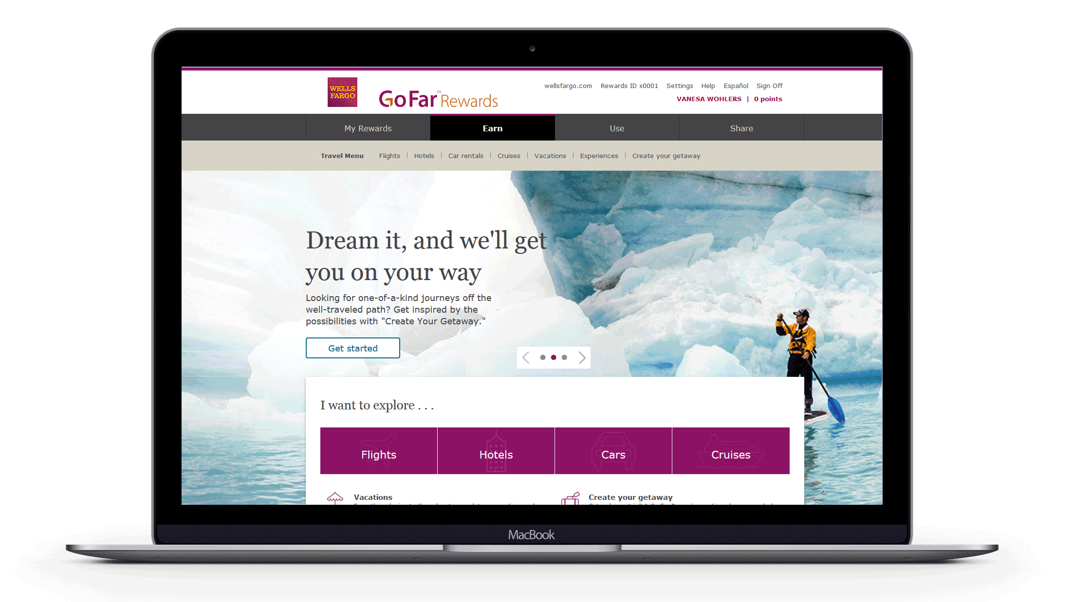
Product carousel fatigue: Desktop, the promotional carousel wasn’t used by travelers who wanted to book quickly.
On mobile, it was even harder to navigate. Text overlaid on top of the imagery became harder to read and less ADA-compliant.
Confusing map feature: An interactive “Destination” map, intended to inspire an increase in bookings, left users confused about the products they could book, rather than motivated..
Utilizing a Mobile-First Redesign Approach
My goal was to streamline the experience, reduce visual heaviness, and improve conversion rates. To accomplish this, I created wireframes that focused on clarity and efficiency:
Removed redundant navigation: The sub-navigation links at the top of the page duplicated links further down, so I removed them to help users stay focused.
Replaced the product carousel with a search widget: By enabling users to immediately choose a travel product to begin their search directly from the homepage in mobile and a full search widget in desktop, we reduced clicks and bounce rates to help users find the right information faster.
Adding New User Features
Beyond structural improvements, I introduced two new features that made booking more seamless:
Traveler Profiles: Frequent travelers often had to re-enter the same passenger details for each purchase. I designed a new feature allowing users to save information for multiple travelers, cutting down booking time for each rewards redemption purchase.
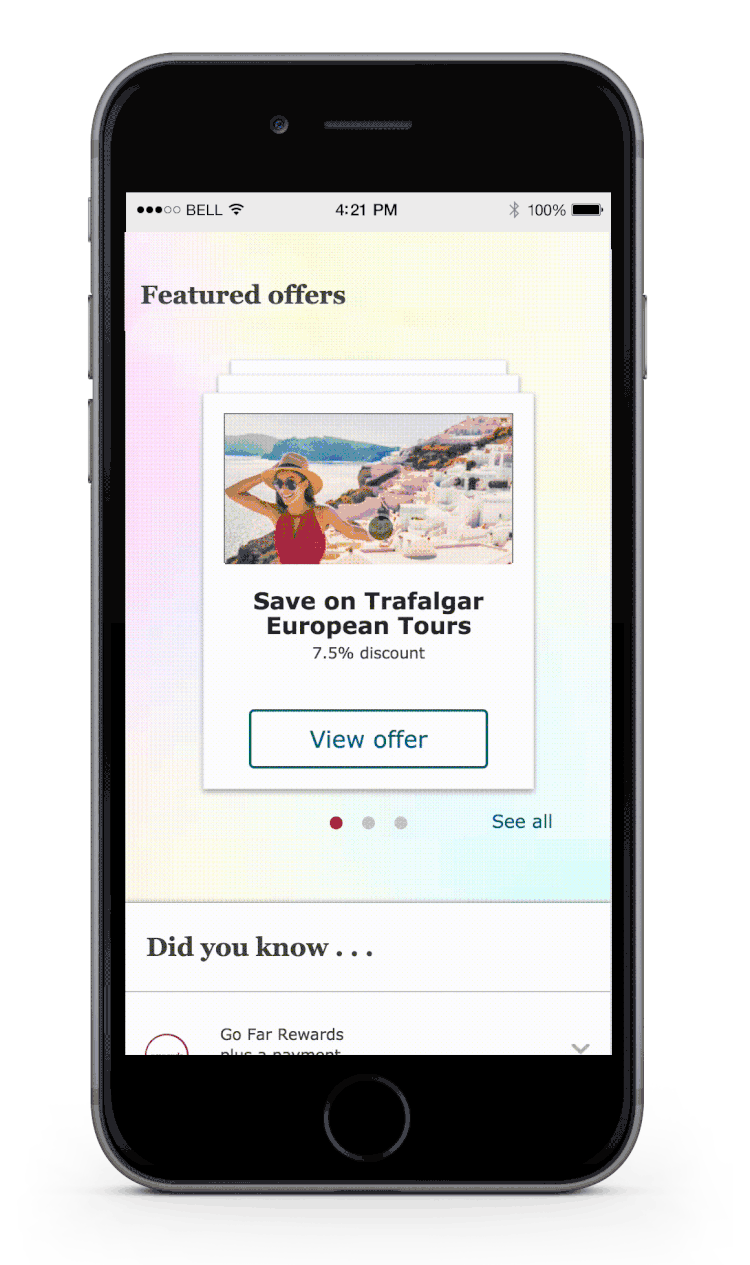
Featured Offers: Previously buried within product-specific pages, special offers were surfaced in a new section tailored to users’ past searches in an interactive swipeable card format.